This week, Canary Media is taking a deep dive into the central questions that animate the work WattCarbon is doing. How do we organize the production and consumption of energy to maximize the carbon benefits of our efforts? The discussion can get a bit esoteric at times, especially if concepts like “marginal carbon emissions” and “carbon loadshape” are new to you.
But the core question being asked is an interesting one: if you were to invest in putting solar panels anywhere in the country, where would your investment have the greatest environmental impact? Ignore for the moment the issue of how many sunny days you might have in a particular area. What you really want to find out is how much carbon is in the existing mix of electricity resources that your solar energy will displace. In an area with mostly coal or natural gas plants, new solar will have a much greater impact than an area powered by hydro or with a large installed base of existing solar.
Most of us have trouble envisioning how grid carbon intensity changes over time. We more or less understand that our bills are higher when we use more energy, but rarely do we get a look at where our energy comes from or how much comes from each type of source (e.g., hydro, nuclear, solar, coal, gas, etc.). Partly this is because your utility is generally not making this decision. It’s being made by a system operator that oversees all production assets in a territory and dispatches them according to contracts and rules to make sure that supply is adequate to meet demand. It’s also because we’ve never tried to make decisions about renewable energy investments based on their relative environmental impacts. But with renewed scrutiny from climate-focused investors, activists, and responsible consumers, this data is now highly relevant.
Carbon Loadshapes
Patterns of energy use are typically visualized graphically, and referred to by insiders as loadshapes. If you array energy consumption over a 24 hour period, you’ll see it rise in the morning, level out or decline during the middle of the day, and typically rise again in the evening before falling off overnight. Carbon loadshapes represent the same idea, but reflect the amount of carbon required to deliver electricity over the course of the day. Consider the chart below from the California Independent System Operator (CAISO). It shows the aggregate amount of carbon produced for each 5-minute period over the course of a recent day. In this case, it looks like a more exaggerated version of a conventional loadshape, but it will often look different depending on when renewables are available on the grid.
For any given end-user, the carbon loadshape of their energy use is found by multiplying the amount of energy they consume in each 5-minute interval by the carbon intensity of the grid for the same time period. This is the number that we care about. It tells us, for every energy asset that’s connected to the grid, how aligned it is with the availability of renewable energy.
Understanding the Grid
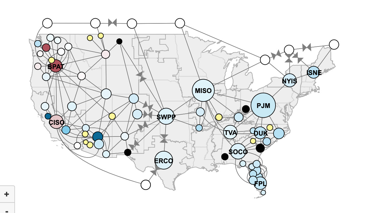
The United States doesn’t have “a grid”. Instead, a semi-interconnected system of system operators and balancing authorities take responsibility for managing procurement and deployment of energy to meet demand across varying geographies. The map below illuminates the heterogeneity of agencies, from large Independent System Operators like MISO and PJM, to tiny municipal governments like the City of Tallahassee, Florida. It’s going to be these 80 agencies that are going to have to figure out how to deploy renewable resources at a scale that has never before been seen, and for which current systems are largely inadequately prepared to support.
Each of these agencies manages a unique portfolio of energy assets that are enrolled into markets under complicated rules, many of which are specific to particular states (e.g., even though Illinois customers are managed by two different system operators, the state sets its own energy policy). These overlapping jurisdictions make it hard to say definitively what happens to the carbon intensity of the grid when, for example, new solar power is brought online. However, visibility into the existing energy mix in these different regions helps us know where to start.
In regions with high fossil fuel concentrations, new solar power will have a larger impact on GHG emissions than in regions powered by renewable resources.
Show me the Data
WattCarbon has been working with project finance investors to evaluate projects based on their anticipated carbon savings. When it comes to renewable energy development, a project proposal will typically come with an expected yield, such as the energy produced each hour of the day over the course of a year. These yields will vary based on the size and location of the project, and the carbon will vary based on the carbon loadshape profile of the local grid.
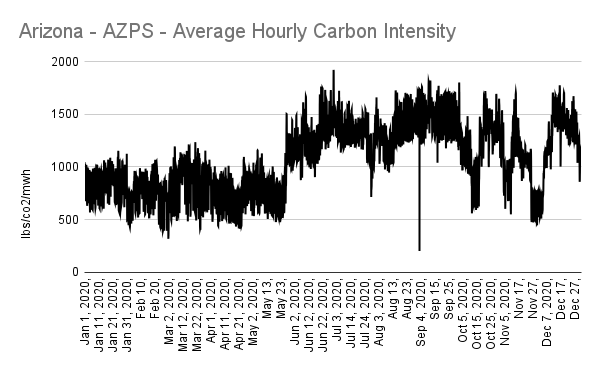
To illustrate the broader concept, even if you have the same hourly yield, depending on where your project is located, you will see very different environmental benefits. As the data below shows, and using a hypothetical 3 MW solar farm as the basis for the analysis, a facility in southern California will yield only a third of the carbon savings as an identical facility across the border in Arizona. And while the sun may shine brighter in these areas than on Long Island, New York, if the production were the same, the carbon impact would be greater in Arizona than on Long Island, despite the fact that the annual average carbon intensity on Long Island is higher than in Arizona.
The following three charts show the carbon intensity of the grid for NYISO’s Long Island territory, CAISO in California, and the Arizona Public Service territory in Arizona. Long Island’s mostly consistent carbon intensity illustrates the low penetration of renewable energy there. By contrast, California and Arizona are powered by diverse energy resources, with both seasonal and hourly fluctuations visible in the availability of hydro, solar, and wind.
Over the course of a year, solar panels will generate the greatest amount of energy during long summer days. In places like Arizona, where the carbon intensity of the grid increases significantly during the summer, this means that projects located here will have a bigger impact than projects located in California where the grid is already significantly cleaner and the carbon intensity peaks in the late fall months rather than the summer. By contrast, on Long Island, solar will be generally helpful, but not particularly so given the lack of existing seasonality in the energy supply.
As these charts illustrate, Long Island’s solar carbon loadshape is relatively uniform, reflecting the normal seasonal production of solar panels. Arizona sees a large spike in the carbon displaced starting in May, coinciding with both peak production and a large increase in the carbon intensity of the grid. California’s carbon emissions are already significantly lower than Arizona’s, so even on the days where solar has its greatest impact in California, the effect is smaller than nearly all days in Arizona.
Conclusions
We are still a long way from decarbonizing the grid. All renewables help move us closer to a point where we can eliminate fossil fuels from our power mix entirely. But if our goal is to maximize the immediate returns on our investments into renewable energy, and if our criteria start with displacing carbon fuels on the grid, we can see that putting solar farms in places like Arizona and Long Island (the full list includes plenty of other high-carbon locales) can have a far greater impact. The same logic applies to any energy asset. It is possible to both quantify the carbon load shape of any building, device, or production system and optimize these assets for the availability of renewables on the grid. Because our grids are changing, these optimization routines will need to be dynamic, however, aligning consumption of electricity with the availability of renewables on the grid will lead us down the fastest path to full decarbonization.


Very useful and informative information. One request: please, when presenting multiple graphs showing the same dataset for multiple areas, use the SAME y-axis scale! At a quick glance, it looks like 3MW of solar on Long Island displaces far more carbon than in Arizona, until you look closely at the labeling of the vertical scale. Make it easy on your readers: keep the scale the same!
The biosphere desperately needs CO2.